Art Pigeon
App redesign for a better touring experience of NYC public art.
CONTEXT
Art Pigeon is an online platform provides users an easy way to tour and learn about the New York city’s most iconic public arts with its location tracking tool. While it is doing great with its website version, its mobile version is far less user-friendly and the fact that the app isn't free has led users to higher expectations. This is a great app with a strong concept and great intention. All it needs is a little upgrade of the user flow and more careful use of consistent icons.
ROLE
UX & UI designer.
TOOL
Adobe XD. Sketch. Photoshop. Illustrator.
TEAM
Kate Almquist. Zhuo Wang. Xueyi Xu.
DURATION
3 Months (2019)
Quick Overview

Hi-fi prototype by Rae
Problems 1
Confusing menu categories
Confusing menu categories
The original design only had 5 categories in its menu bar with many sub-categories hiding under. Users sometimes had to unfold more than 2 layers to get to a clickable button. To improve this, we decided to move some sub-categories up to the first layer.
When Kate passed her lo-fi prototype to me, I took it to 3 users and did another round of user testing. In this process, I found that the order of the menu categories wasn't intuitive enough for users to understand it clearly.
Solution
I decided to use the "card sorting" method for a more logical order. In the research process, the interviewees were asked to resort cards that had the name of the menu on it. The result showed that users were sorting the menu based on this factors:
I decided to use the "card sorting" method for a more logical order. In the research process, the interviewees were asked to resort cards that had the name of the menu on it. The result showed that users were sorting the menu based on this factors:
Key features >>> Suggested collections from others >>> Specific art type
Problems 2
Impossible to locate an art work by its name or artist
Impossible to locate an art work by its name or artist
When users were being asked to complete the task like "find out the location and information of Flabbergast by Todd Gray", out of 4 users, no one was able to complete the task without interviewer's assistance.
Solution
To solve this problem, we thought the best way is adding a "search" function and provide suggestion answers under the search box for conveniences. The search icon will be placed on the top left corner and will transformed into "return to last page" icon when user is no longer on the home page.
To solve this problem, we thought the best way is adding a "search" function and provide suggestion answers under the search box for conveniences. The search icon will be placed on the top left corner and will transformed into "return to last page" icon when user is no longer on the home page.

Hi-fi prototype by Rae

Problems 3
Inconsistent UI
Inconsistent UI
It was very misleading when icons had different style and stroke thickness across the app. For example, in the original design homepage, the "menu" icon was a circle with filled orange color on the top left corner. However, when user navigated to any other pages, the menu icon became a stroke circle on the top right corner. The inconsistent use of icons was confusing, misleading and visually unpleasing.
Solution
For this reason, I've redesigned a set of icons and set up rules for the placement of them.
For this reason, I've redesigned a set of icons and set up rules for the placement of them.


Who are the users? 🤨
To answer this question, we designed 2 personas: Selena and Leon.
Selena wants to explore public art because not only she loves it but also she gets inspired by it. She represents the type of user who purely loves art and always wants to know more about it. Leon is a photographer who is an influencer on Instagram and other social media platforms. He uses art as a tool to attract followers. Therefore, he is looking for famous art pieces. As a tourist who only have limited time to explore the city, Leon wants to plan his route efficiently.

Usability Testing 🧪
The usability test was conducted with 4 participants. Three of the participants were NYU students, and one of them was a mid-aged New Yorker. Before the official test, we created a test script which included 3 parts: pre-test interview; 6 tasks; post-task interview.
Based on the usability test, we identified several problems that need to be solved immediately. First of all, it was almost impossible to find a certain artwork in the app, because there was no search bar. Secondly, there were too few categories to facilitate the searching. Thirdly, some of the buttons were not intuitive enough that users cannot recognize their functions immediately. Fourthly, it took too many clicks to transfer among pages.
Synthesis with journey map 🫀
By integrating Leon's persona and the usability test result, we created a journey map. This journey map identified the steps Leon had to take to plan a visiting route and get to a specific artwork by using Art Pigeon. Each step was divided into several activities that represented each of his interactions with the app. An emotion was assigned to each activity. Through those emotions, we clearly spotted the interactions that need improvement the most. We also recognized additional improvement opportunities, such as organizing the content of each category, add more influencer favorites collections, add introduction for each influencer collection, add transportation information, etc. The journey map helped us to brainstorm the redesign plan.

designed by Zhuo Wang
Solutions 🧶
Using the results of our usability test report and our expert analysis we began our brainstorming. We divided up into three groups, one under each column. We gave ourselves two minutes to write as many things as we could think of under each column, then rotated, until everyone had the chance to work on each column.
After we had each worked on all columns, we gathered as a group and took stock of our ideas, crossed off some we didn’t like, added on to others, then generated some new ideas. We finalized our most important ideas and decided which ones to sketch.
At the end of this brainstorming session, we decided to change 3 things:
1️⃣ Add search function
2️⃣ Add bookmark function
3️⃣ Replace "Influencers" list with "Artists’ favorite" list.

Sketches ✍🏻
The addition of a search field was the most important feature to be added, as revealed by our usability testing, brainstorming and expert analysis. Our sketches show our initial idea of how this would work.
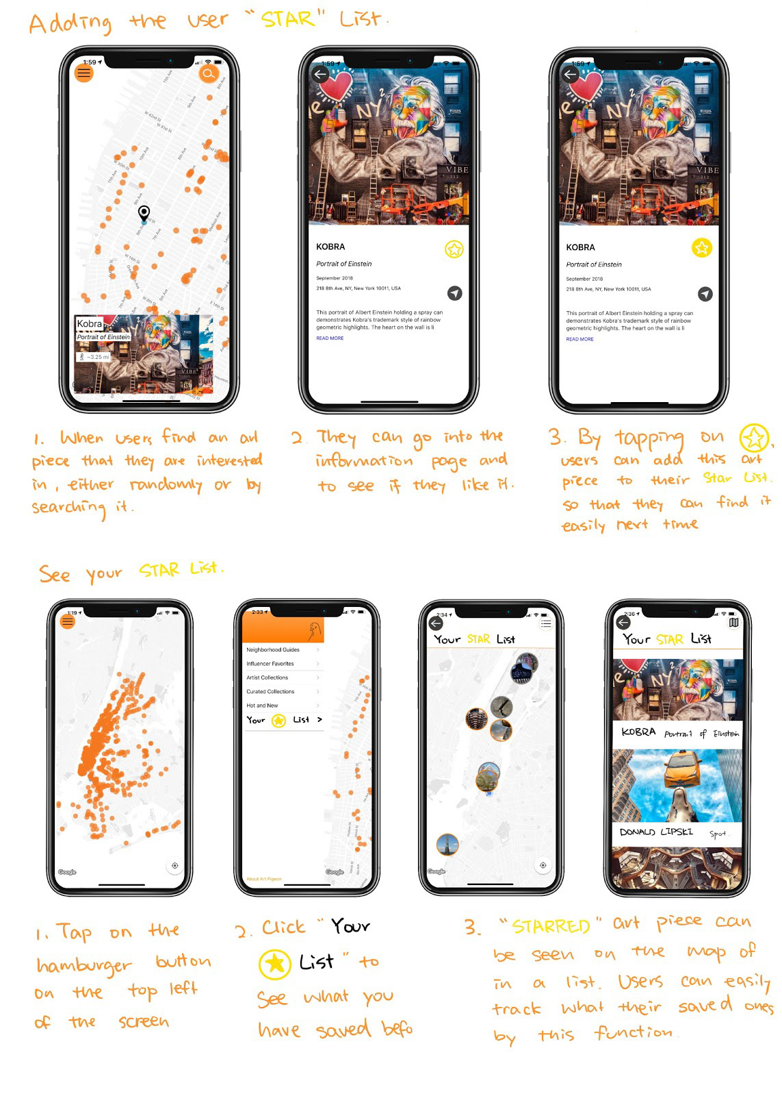
The addition of a “star” or user “collection” list was also identified as an important feature that would add to the functionality of the app. Our sketches outline how that could work.
The last improvement we sketched up for this phase was to replace the Influencer Favorites lists with Artists’ Favorites lists. Our usability testing and expert analysis revealed that the Influencer Favorites lists were not helpful to our users since the criteria for being an “influencer” was not well defined. Artists’ Favorites lists would be more helpful for those looking for expertly curated lists.


The biggest change to the app layout in the lo-fi prototype was the addition of the search feature. We added a top navigation bar, which provided access to the search feature on the left side, access to the main menu on the right side, and the title of the app in the middle. The title of the app had previously not appeared anywhere on the home page. The app name served as a home page link in the lo-fi prototype.
Other features we added to the lo-fi prototype were the star list and additional categories of art in the main menu. We built the lo-fi prototype to test completion of these tasks:
1️⃣ Find information and location of an artwork titled Flabbergast.
2️⃣ Find a piece of subway art and read an external article about it.
3️⃣ Find a piece of art and add it to your star list.

left: original design >> right: lo-fi prototype
Sketch and lo-fi prototype by Kate Almquist
User Testing 👩🏻💻
Most users could easily complete the tasks we built the lo-fi prototype to test. We also received some important feedback:
1️⃣ The home button is strange on an app.
2️⃣ The main menu is not well organized, we should rethink it.
3️⃣ We should think about adding text labels for star list, such as: “save,” then after selected, changes to, “saved.”
4️⃣ We should think about keeping the top navigation bar visible all the time.
Card sorting method 🗂
After Kate passed the sketches to me, I took it to 3 users and found out another issue: the menu order wasn't easy to understand. To make the menu more intuitive to understand, I decided to ask the interviewee to rearrange the menu order based on their understanding. I handed them over cards with all the main and sub-categories on it in a random order. Then I asked them to resort the items and to explain why. The result showed that interviewee intended to sort the menu based on these three factors:
📌 Key features of Art Pigeon
📌 Recommendations from a third party group
📌 Categories based on art type
With the information we collected in mind and our insight of the app, I re-ordered the menu to have a clearer classification.


Hi-fi prototype 🦋
In the hi-fi prototype, there were 4 main improvements:
1️⃣ Consistency of the menu button: In the lo-fi prototype above, menu icons are not available throughout all the pages. It’s only available in the home page and is replaced by a map or other icons on other pages. In the hi-fi prototype, we decided to keep it available on the top right corner so that wherever the user is, he/she can navigate to other pages by clicking on the menu icon. We let 2 users we found on the 4th floor of 370 Jay st to play with both the old version and the new version, users told us that they feel like they have more control over the new app because of the consistent placement of menu icon.
2️⃣ More efficient design for faster “home” page return: In the hi-fi prototype, we make sure that everything is only two clicks away from the home page. We have thought about adding a home button and other function buttons on the bottom of the page just like other apps (for example, Google Map -- which has both top and bottom function buttons available). However, since this app is about reading, exploring and navigating, we want to keep the “opening” feeling of the app by not adding too much clutter into the page.
Will it cause problems? We will need to do further testing on this to find out if people will get frustrated by not seeing the home button even when everything is only two clicks away from home.
3️⃣ Consistency of icon style: In the lo-fi prototype, each button had different looks. Some icons were going for the minimal linear look while some have a very big colored circle behind it with a high contrasting color. This was also an issue with the original design. When we ran user testing on the lo-fi prototype, we got feedback that users were bothered with how buttons were looking differently. “Whenever I navigate to a new page, I questioned myself if I’m still on the same app.”
For this reason, we decided to unify all the icons’ style. We decided to go for the minimal linear look since it will make the app look .
4️⃣ Placement of “Collect” and “Direction” icons: From original design to lo-fi prototype, we added a star icon on each artwork page which allowed users to collect things that interested them. However, from the feedback we noticed that the design of the yellow star button confused users between “collect” and “collected” state. For this reason, we changed the color of the icon to symbolize “uncollected” status in grey and “collected” status to orange.
From user feedback we also learned that the users barely noticed that there was a “direction” icon because of its weird placement in between the article. In order to eliminate this confusion, we decided to place both the “collect” and “direction” icon on top of the image with a tinted gradient black bar behind.